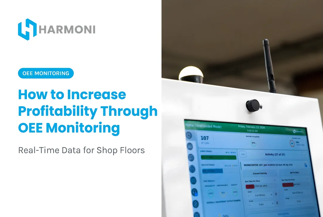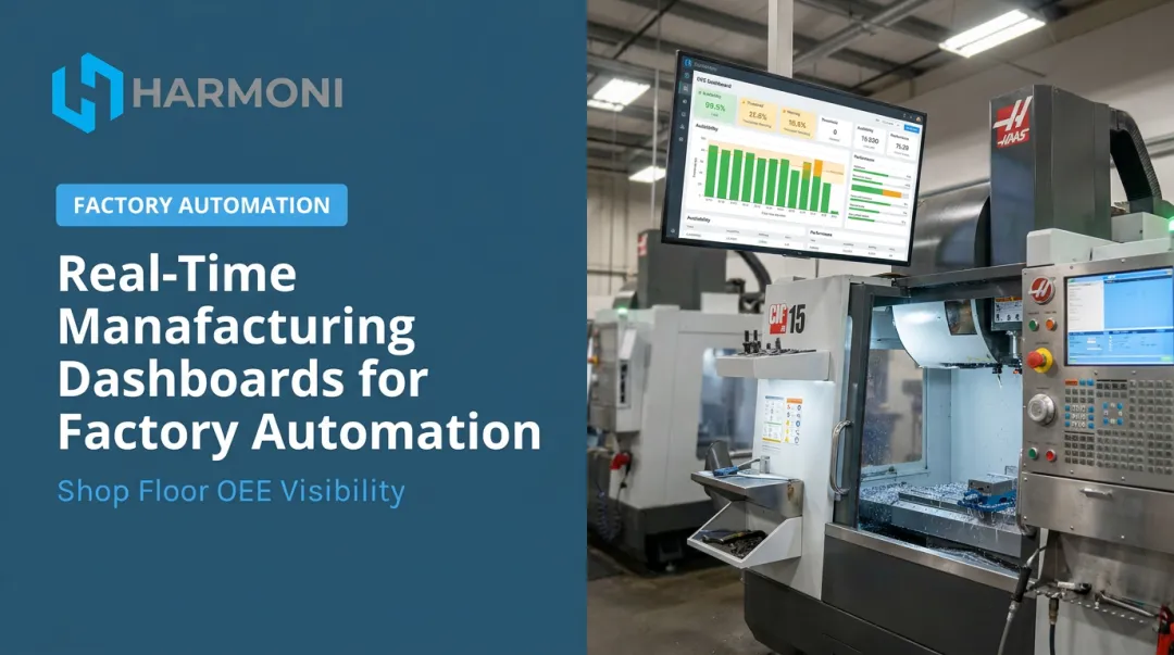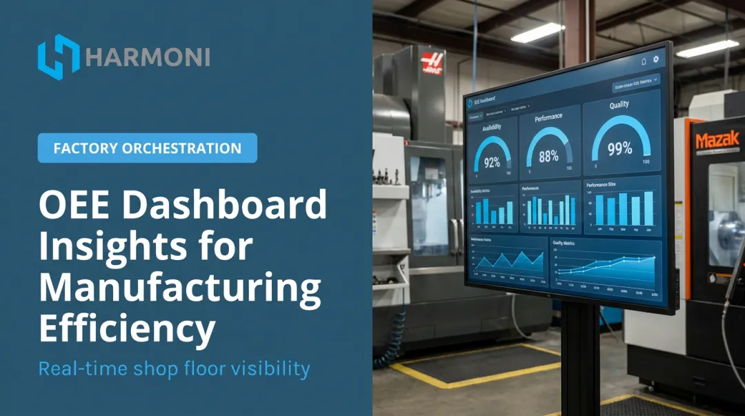
An OEE dashboard changes that equation. It turns raw machine data, operator activity, and quality records into a live picture of where production is being lost — across availability, performance, and quality — so teams can act during the shift, not after it.
This guide covers what an OEE dashboard is, how OEE is calculated, what features to look for, the business benefits, and how to implement one effectively.
Key Takeaways
- OEE = Availability × Performance × Quality; 85% is world-class, 60% is typical for discrete manufacturers
- An OEE dashboard is live, not end-of-shift — it surfaces losses as they happen
- Machine data alone isn't enough — ERP context and operator inputs explain the root cause behind losses
- Role-based views make data actionable for operators, supervisors, and managers differently
- Clean data and frontline adoption determine whether a dashboard drives real improvement
What Is an OEE Dashboard?
An OEE dashboard is a digital production visibility tool that displays real-time Overall Equipment Effectiveness scores — combining availability, performance, and quality data — in a visual format that operators, supervisors, and managers can act on immediately.
The key word is real-time. An OEE dashboard is not a production report. Reports document what already happened. A dashboard surfaces trends as they develop, letting teams intervene mid-shift instead of reviewing losses after the fact.
The difference is operational leverage. A report tells you Line 3 ran at 71% OEE yesterday. A dashboard tells you Line 3 dropped to 64% at 10:42 AM — and that the performance component specifically started degrading after a tooling changeover. One supports a post-mortem. The other enables a fix.
Measuring OEE at Different Levels
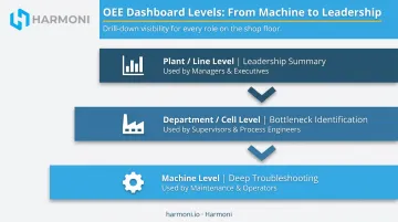
OEE dashboards operate at three levels, each answering different questions:
| Level | Primary Use | Best For |
|---|---|---|
| Machine | Deep troubleshooting of individual assets | Maintenance and operators |
| Department / Cell | Identifying bottleneck workcenters | Supervisors and process engineers |
| Plant / Line | Summary view for leadership and daily reviews | Managers and executives |
These levels work best together. A plant-level dashboard might show OEE dropping on Line 3. A supervisor drills into department-level data to isolate the bottleneck. An operator checks the machine-level view to find the specific cause. That layered structure is what separates a dashboard from a report — instead of reconstructing what went wrong after the shift, teams can pinpoint it while the machine is still running.
The Three Components of OEE: Availability, Performance, and Quality
OEE is calculated as:
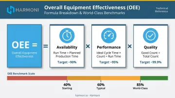
OEE = Availability × Performance × Quality
A score of 100% means a machine produced only good parts, at full speed, with zero unplanned stops — a theoretical ceiling rather than a realistic target. According to LeanProduction, 85% OEE is considered world-class for discrete manufacturers, while 60% is fairly typical. Companies just starting to measure often find they're running at 40%.
That 25-point gap between typical (60%) and world-class (85%) represents a substantial amount of recoverable production capacity sitting on the floor undetected. Understanding what drives each component is the first step toward closing that gap.
Availability
Availability = Run Time ÷ Planned Production Time
Availability measures the percentage of scheduled time the equipment actually runs. Common availability losses include:
- Unplanned breakdowns
- Changeovers and setups
- Startup delays and warm-up time
The distinction between planned and unplanned downtime is critical. Planned maintenance doesn't penalize availability the same way an unexpected breakdown does — and treating them the same muddies your improvement data.
Performance
Performance = (Ideal Cycle Time × Total Count) ÷ Run Time
Performance captures how efficiently the machine runs while it is operating. This is where micro-losses hide. Minor stoppages, slow cycles, and brief hesitations rarely get recorded individually — but they stack up. One automotive MSME case study found minor stoppages alone consumed 30 minutes per shift before improvement efforts reduced them to 15 minutes.
Some platforms — Harmoni's factory orchestration platform included — measure performance against the ERP-estimated cycle time rather than theoretical maximum speed. For high-mix, low-volume job shops, that's a more actionable baseline: theoretical maximums rarely reflect real job complexity.
Quality
Quality = Good Count ÷ Total Count
Quality captures the ratio of conforming parts to total parts produced. Losses include scrap, rework, and startup rejects — parts made before the process stabilizes.
Quality problems caught in real time prevent a single bad setup from compounding across an entire shift. Catching a quality deviation at part 12 is a minor correction; catching it at part 180 is a production crisis.
Key Features of an Effective OEE Dashboard
Not all OEE dashboards are built equally. These are the features that separate a display that drives decisions from one that just fills a screen.
Real-Time Data Integration
A dashboard built on delayed or manually entered data cannot drive in-shift decisions. An effective OEE dashboard connects directly to machine signals, PLCs, and CNC controls so data is live and automatic, rather than dependent on an operator entering numbers at shift end.
Harmoni's platform pulls data directly from major CNC controls (Mazak, Haas, Fanuc, Heidenhain, Siemens, DMG MORI, Makino, Fadal) alongside RFID-captured operator activity and ERP job data — eliminating manual entry at the source.
Role-Based Views
One-size-fits-all displays fail because different roles need different data:
- Operators need current cycle times, downtime events, and target pace — now
- Supervisors need shift-level summaries and exception flags across their workcenters
- Managers need trends across machines, shifts, and time periods to spot systemic issues
A plant manager staring at raw cycle time data — or an operator handed a six-month trend chart — gets confusion, not direction.
Integration with ERP and Operator Context
Machine data alone tells you what happened. It rarely tells you why.
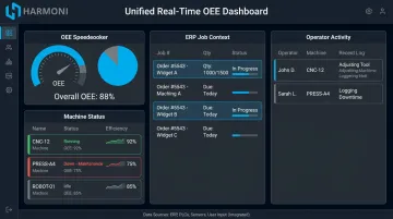
Knowing a machine was idle for 22 minutes is marginally useful. Knowing it was idle because a work order wasn't released, a material kit wasn't staged, or an operator was pulled to a different cell — that's actionable. Effective OEE dashboards connect to ERP systems and capture operator context alongside equipment signals, turning a metric into a root cause tool.
What this looks like in practice: machine signals, operator activity via RFID, and ERP workflows unified in a single real-time view. That's the data layer Harmoni's factory orchestration platform provides. In the WessDel deployment, connecting machines and ERP data through Harmoni delivered 17 productive hours per employee per month and reduced delinquent jobs by 10%.
Alerts and Thresholds
An effective dashboard doesn't wait for users to notice a problem. When performance dips below target cycle time or scrap crosses a defined threshold, the system notifies the right person so intervention happens in real time. Harmoni's Visual Factory andon-style indicator lights communicate live OEE conditions directly on the shop floor: no one has to be watching a screen to know something's wrong.
Historical Trends Alongside Real-Time Data
Snapshot data shows current state. Trends reveal patterns — recurring downtime causes by shift, day-of-week performance dips, or progressive quality degradation over a tool's life cycle. Dashboards that display both live and historical data let teams separate one-off events from systemic problems worth investing in.
The Benefits of an OEE Dashboard in Manufacturing
Faster Problem Detection and Response
Real-time OEE visibility compresses the gap between a problem occurring and someone addressing it. One aerospace manufacturer tracked by Modern Machine Shop installed machine monitoring on 10 Okuma lathes and watched utilization climb from 53% to 65% or higher within six months — with an immediate uptick occurring simply from making the data visible on a large shop floor display.
Visibility alone changes behavior. Operators and supervisors who can see a loss happening act on it before the shift ends — not during the next morning's review.
Structured Continuous Improvement
OEE dashboards give Lean and Six Sigma teams something they often lack: a measurable baseline and a live feedback loop. Without objective data, it's difficult to know whether a process change improved availability, performance, or quality — or whether observed gains were just natural variation.
That's where OEE data becomes the foundation for systematic improvement. McKinsey research found predictive maintenance reduces machine downtime by 30–50% — but capturing those gains requires knowing where downtime is occurring in the first place.
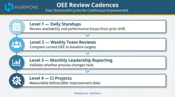
OEE dashboards support this by feeding structured operational reviews at every cadence:
- Daily standups focused on yesterday's availability and performance losses
- Weekly team reviews comparing current OEE to baseline targets
- Monthly leadership reporting that validates whether process changes held
- Continuous improvement projects with measurable before/after data
Accountability and Cross-Functional Alignment
When operations, quality, and maintenance teams are all looking at the same OEE numbers, conversations about improvement priorities become faster and less political. A shared display creates a common language. Disputes about whether a loss is a machine issue or a materials issue get resolved faster when the data shows exactly when it started and what was running at that moment.
Best Practices for Implementing an OEE Dashboard
Start with Clean, Reliable Data
A dashboard is only as good as the data feeding it. Before launching, confirm that run time, downtime, cycle count, and reject count data is accurate and consistently captured. Wherever automation can replace manual entry, use it. Manual data is slow, inconsistent, and rarely captures the granularity needed for meaningful OEE analysis.
Involve the People Who Will Use It
Dashboards built without frontline input often go unused. Operators and supervisors know which data points actually influence their decisions during a shift — and which ones are just noise. Building in their perspective early also drives adoption. Teams are far more likely to act on data they had a hand in defining.
Make It Part of the Daily Workflow
A dashboard displayed in a breakroom that nobody references creates no value. Embed OEE data into:
- Shift handoff meetings: review what happened and flag what to watch for
- Morning production reviews: set priorities based on yesterday's losses
- Daily standup routines: treat OEE as a shared accountability reference, not a passive monitor
The dashboard becomes a management tool when it's part of how teams run the shift — not something checked occasionally after the fact.
Frequently Asked Questions
How do you measure Overall Equipment Effectiveness (OEE)?
OEE is calculated by multiplying Availability × Performance × Quality, each expressed as a percentage. Availability requires run time and planned production time; Performance requires ideal cycle time and total parts count; Quality requires good parts count and total parts count. All three data inputs should be captured automatically where possible.
What are examples of good KPI dashboards?
Good KPI dashboards display a focused set of actionable metrics rather than everything available, use clear visual indicators like gauges and color-coded thresholds, and are tailored to the viewer's role. An operator-level dashboard shows current cycle status; a manager-level dashboard shows trends across machines and shifts.
What is the 5-second rule for dashboards?
The 5-second rule is an informal UX principle: a viewer should grasp the key status of a dashboard within 5 seconds. This is achieved through clear layout, a limited number of metrics, strong visual hierarchy, and color-coded alerts that draw the eye immediately to what needs attention.
What OEE score is considered world class?
85% is the widely cited world-class benchmark, with component targets of roughly 90% availability, 95% performance, and 99.9% quality. That said, the right target depends on industry, machine type, and product mix. Consistently improving OEE over time matters more than hitting an arbitrary number.
What is the difference between OEE and OPE?
OEE focuses on individual machine performance across availability, performance, and quality. OPE (Overall Process Effectiveness) broadens the view to include people, material flow, and process-level factors, making it more relevant when human activity or upstream/downstream constraints drive production loss. OPE lacks a formal standards-body definition and is used variably across industry sources.
What data sources does an OEE dashboard typically pull from?
OEE dashboards connect to machine signals and CNC controls, ERP systems, operator inputs for downtime reason codes, and quality inspection data for scrap and rework counts. Platforms like Harmoni integrate all of these into a unified real-time view, adding RFID-captured operator activity and digital quality checksheets for full production context.