Introduction
Many manufacturers run full shifts, keep machines humming, and still miss output targets. The frustrating part? The reasons are rarely mysterious — they're just invisible. Micro-stops that last 90 seconds, changeovers that run 20 minutes over, a quality issue that doesn't surface until the end of the run. By the time anyone sees the numbers, the shift is over.
That's the problem an OEE dashboard is built to solve. By turning raw machine data into a real-time picture of where time, speed, and quality are bleeding away, it moves the conversation from "what happened?" to "what's happening right now?"
What most machine-only monitoring setups miss is context — who was running the machine, what job was active, and what the ERP said should have happened. This guide covers what an OEE dashboard should measure, which insights actually move the needle, and how layering in operator behavior and ERP data surfaces losses that raw machine data alone never will.
Key Takeaways
- OEE = Availability × Performance × Quality — small losses in each multiply into significant lost capacity
- According to MESA/LNS research, only 19% of manufacturers had real-time performance visibility at the line level
- Performance losses — micro-stops, speed drift — are often the largest driver of lost output and the hardest to see
- Machine-only dashboards miss operator-caused availability losses
- Connecting OEE to ERP job data turns raw machine data into an explainable, job-level production event
What Is an OEE Dashboard?
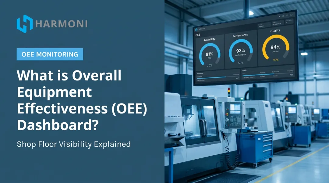
An OEE dashboard is a visual command center that tracks manufacturing productivity in real time by displaying the OEE score — Overall Equipment Effectiveness — and its three components: Availability, Performance, and Quality.
The formula is straightforward:
OEE = Availability × Performance × Quality
That single score compresses three distinct failure modes — downtime, speed loss, and defects — into one number a supervisor can act on immediately.
Dashboard Scope Options
OEE dashboards can operate at different levels depending on what question needs answering:
- Machine-level — tracks a single asset; best for diagnosing specific bottlenecks
- Line-level — captures how a group of machines performs together; useful for shift supervision
- Factory-level — aggregates across all lines or sites; suited for leadership and planning
What Separates a Good Dashboard From a Basic Report
Knowing which scope level to monitor is only part of the picture. The other part is timing: a reporting tool tells you what happened after the shift ends, while a well-built OEE dashboard surfaces losses as they occur so supervisors can still do something about them.
The key differences:
- Updates continuously during the shift, not just at the end
- Surfaces losses as they occur so supervisors can still intervene
- Connects individual metrics to root causes, not just final scores
The Three Core OEE Metrics and What They Reveal
Each of the three OEE components exposes a different category of loss. Understanding what each measures — and where it tends to hide — determines whether your dashboard becomes a diagnostic tool or just a scoreboard.
Availability
Availability = (Operating Time ÷ Planned Production Time) × 100
Availability measures how much of your planned production time the equipment is actually running. Low availability signals unplanned downtime, extended changeovers, or machines waiting on materials and operator attention.
These losses often go undocumented in paper-based environments. Without structured reason codes, downtime simply disappears into the shift.
Performance
Performance = (Actual Output ÷ Maximum Possible Output) × 100
Performance measures how fast equipment runs relative to its designed capacity. This is where most dashboards develop blind spots.
Performance losses are frequently invisible because:
- Micro-stops under two minutes often don't trigger a formal downtime event
- Speed reductions from worn tooling happen gradually, not suddenly
- Conservative operator pacing is rarely logged at all
These losses build across a shift undetected — and can represent the single largest driver of lost output.
Quality
Quality = (Good Units ÷ Total Units Produced) × 100
Quality measures the percentage of output that meets specification on the first pass. The key word is first pass — parts that get reworked still consumed machine time and material. Rework completion doesn't undo that cost.
Why Multiplication Matters
The three metrics don't add together — they multiply. That math has a significant implication:
A machine running at 90% Availability × 90% Performance × 90% Quality = 72.9% OEE.
Three metrics that each look "pretty good" individually compound into more than a quarter of capacity gone. A vendor-published benchmark across 1,470+ discrete manufacturing operations reported an average OEE of 66.8% in 2024 — meaning the typical discrete manufacturer is losing roughly a third of its available capacity to these compounding losses.
The Six Big Losses Framework
Total Productive Maintenance (TPM) maps OEE components to six specific loss categories:
| OEE Component | Loss Categories |
|---|---|
| Availability | Equipment failures; setup and changeovers |
| Performance | Minor stops and idling; reduced speed |
| Quality | Startup rejects; production defects |
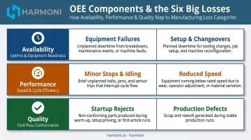
This mapping turns an OEE dashboard into a diagnostic instrument — so instead of seeing that Availability is low, you know exactly which loss category is driving it and where to focus corrective action.
Key Insights an Effective OEE Dashboard Surfaces
The value of an OEE dashboard isn't the number itself. It's what the number makes visible — and when.
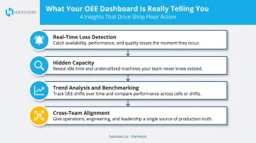
Real-Time Loss Detection
Discovering that a line ran at 58% OEE at the end of a shift is informative. Seeing that number slide in real time, mid-shift, is actionable.
A live dashboard gives supervisors a window to intervene while production is still running — adjust pacing, address a micro-stop pattern, escalate a quality issue before it compounds. End-of-shift reports capture what happened. Real-time visibility creates the opportunity to change it.
Hidden Capacity
Most manufacturers facing output shortfalls assume the answer is more equipment or more overtime. An OEE dashboard often tells a different story.
When existing equipment is running at 65-70% OEE, the question isn't whether to buy another machine — it's whether targeted improvements to availability, speed, or quality could close the gap without capital investment. A one-point improvement in Performance across five machines is capacity that already exists and doesn't appear on any capital request.
Trend Analysis and Benchmarking
A single OEE snapshot tells you where you stand today. A trend line tells you whether you're improving — and how fast.
Shift-over-shift and rolling trend views help teams answer questions that a daily number cannot:
- Is this improvement initiative actually working, or just natural variation?
- Do certain shifts or operators consistently correlate with higher OEE?
- Is this loss pattern recurring on Mondays, or random?
Patterns only appear with time — which is why historical benchmarking in the dashboard matters as much as real-time visibility.
Root Cause Traceability
Knowing OEE is low is the beginning of the problem, not the end. The dashboards that drive real improvement let users drill down from a score into the specific loss events behind it — downtime reason codes, quality reject categories, speed deviation logs.
Without that drill-down capability, a team can see that something is wrong but lacks the precision to act on it.
Cross-Team Alignment
Once root cause data is visible, alignment across teams becomes far easier. OEE dashboards work best as a shared source of truth — when operators, supervisors, engineers, and plant managers are all looking at the same numbers in the same format, the disagreements that arise from teams tracking productivity differently disappear.
That shared visibility also changes the tenor of shift handoffs and daily ops meetings. Instead of debating what the numbers were, teams can spend that time on what to do next.
Why Most OEE Dashboards Leave Blind Spots
A machine state signal — running, stopped, faulted — is a starting point, not a complete picture. Most OEE dashboards stop there. That creates a structural gap.
The Operator Behavior Gap
A meaningful portion of availability and performance losses are not caused by machine failure. They're caused by what's happening around the machine:
- An operator walking to a shared ERP terminal to clock into a job
- Hunting for the correct setup sheet or tooling
- Waiting for a job assignment that hasn't been released yet
- Manually entering data into a separate system after the fact
Machine-only monitoring captures the idle time. It cannot explain it — and a dashboard that only shows a loss without identifying the cause has limited operational value.
This is a documented pattern. A 2023 study in the Sage Journals using Analytic Hierarchy Process methodology and ISO 22400 taxonomy found that "definition and execution of standards, quality and procedures" carried the highest human-factor weight in OEE — 0.38 out of all identified factors — confirming that OEE loss causation extends well into operator behavior and process execution.
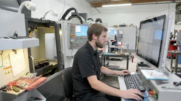
WessDel, an aerospace and defense machine shop, experienced this directly. Before deploying Harmoni, operators were walking to shared ERP terminals to clock in and out of jobs — averaging 11 minutes per ERP transaction. The machine state said "running" or "idle." It said nothing about why cycle records were delayed or why job costing data was chronologically inaccurate.
The ERP Context Gap
OEE data without ERP context creates a second blind spot. When a machine shows low utilization, the interpretation depends entirely on context:
- Was the job queue empty?
- Was the wrong job scheduled first?
- Did the changeover take twice as long as planned?
Without ERP job data integrated — work orders, scheduling, routing, quoted cycle times — the OEE reading is an observation without an explanation.
What a Unified View Looks Like in Practice
When a supervisor can see simultaneously that Machine 4's availability dropped, that the operator spent 18 minutes waiting for a job assignment, and that the work order wasn't released on time — the corrective action is obvious. Without those three data streams in one place, the investigation takes hours.
Harmoni's factory orchestration platform is built specifically for this kind of unified view — combining machine signals, operator activity via long-range RFID, and ERP job data into a single real-time picture. The result is that manufacturers can see not just what is happening on the floor, but the operational reasons behind it.
At Machine Specialties, Inc. (MSI), a high-precision aerospace and defense manufacturer, the transition from spindle time tracking to earned hours — derived by combining machine cycle data with ERP job costing data — was only possible because all three data streams were unified. That shift revealed profitability context that spindle time alone could never show.
The Job Costing Implication
The MSI example points to a broader implication. When OEE data includes operator time and job context, job costing shifts from estimated to accurate. Actual machine run time, operator involvement, and output are all captured together — meaning manufacturers can see whether a job is running to cost during production, not after the invoice.
Steps to Build a More Actionable OEE Dashboard
Step 1 — Define Scope and Identify Data Sources
Start at the machine level with one or two assets that represent different challenge types — one high-availability/low-performance machine and one with frequent changeover losses, for example.
Data inputs to identify upfront:
- Runtime signals (from CNC controls or sensors)
- Production counts and cycle times
- Defect counts and reject reason codes
- Operator inputs (structured, not freeform)
Determine which sources are automated and which require operator input. Dashboard reliability depends directly on input reliability. Building on incomplete or manually estimated data gives you a scoreboard — not a diagnostic tool.
Harmoni connects directly to CNC controls from Fanuc, Haas, Mazak, Siemens, Heidenhain, DMG MORI, Makino, and Fadal. For legacy machines without native connectivity, built-in current sensors read machine state from existing electrical signals — no machine replacement required.
Step 2 — Design for the Right Audience
A single dashboard for everyone serves no one well. Each role needs different information:
| Audience | What They Need |
|---|---|
| Operators | Current shift OEE, active issues, job status |
| Supervisors | Line comparison, downtime reasons, shift trends |
| Plant managers | Cross-line performance, week-over-week improvement, cost impact |
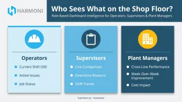
Design with the end user in mind. Operators need immediate, machine-side feedback. Managers need trend data they can act on in planning meetings.
Step 3 — Set Targets, Configure Alerts, and Connect to Existing Systems
Three actions make this step work:
- Set target OEE levels for each line and each component metric
- Configure threshold alerts so the right person is notified in time to act, not after the shift ends
- Connect the dashboard to the ERP and machine ecosystem already in place — an isolated dashboard that doesn't integrate with daily systems gets checked less and less over time
Harmoni integrates natively with Epicor, Infor, Infor Visual, ECI JobBoss, JobBoss2, ABAS, and ODOO. Deployments typically complete in weeks, with no equipment or system replacement required.
Best Practices for Getting More From Your OEE Data
Three habits separate shops that see results from OEE data from those that collect it and move on.
Build OEE Into the Daily Rhythm
Displaying dashboards during shift handoffs and production meetings changes OEE from a management metric into a team conversation. Operators and supervisors who review numbers together surface context that data alone never captures. They develop shared ownership over performance — rather than treating OEE as a compliance audit from above.
Fix the Biggest Losses First
Most OEE loss traces back to a small number of recurring causes. The approach that works:
- Identify the top two or three loss drivers
- Fix them, then measure the impact before moving on
- Repeat the cycle with the next priority
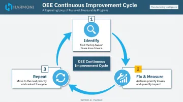
Trying to address every metric simultaneously tends to improve none of them meaningfully.
Treat the Dashboard as a Living Tool
As teams get more comfortable interpreting data, they will identify new metrics they need, clearer visualizations, and more specific reason codes.
Build in a regular review cadence — quarterly at minimum — to update the dashboard based on user feedback and changing operational priorities. A dashboard that made sense at go-live may not reflect how the floor actually operates twelve months later.
Frequently Asked Questions
What is an OEE dashboard?
An OEE dashboard is a visual tool that displays real-time and historical data on Overall Equipment Effectiveness: the product of Availability, Performance, and Quality. It helps manufacturers pinpoint time, speed, and quality losses across equipment and production lines so teams can act during a shift rather than after it.
Is 80% OEE good?
80% is high relative to most benchmarks — MESA/LNS research found only the top 11% of surveyed manufacturers averaged 80 or higher. World-class targets are commonly cited at 85%, but improvement trajectory matters more than hitting a specific number. The real question is whether the losses behind your current score are understood and being addressed.
What are the three components of OEE?
The three components are:
- Availability: percentage of planned time the machine is actually running
- Performance: how fast the machine runs relative to its ideal speed
- Quality: percentage of output meeting specification on the first pass
All three multiply together to produce the OEE score, which is why small losses in each compound quickly.
What causes low OEE in manufacturing?
The Six Big Losses cover the main categories: unplanned equipment failures, extended changeovers, minor stops, reduced running speed, startup rejects, and in-process defects. Operator-related delays and scheduling gaps are also frequent contributors that machine-only monitoring tends to miss.
How often should OEE be monitored on a dashboard?
Real-time or near-real-time monitoring is ideal because it allows teams to intervene during a shift rather than discovering losses afterward. Shift-level and daily trend views add the context needed for longer-term improvement decisions — both cadences serve different purposes and work best in combination.
What is the difference between machine-level and factory-level OEE?
Machine-level OEE tracks individual equipment performance and is most useful for diagnosing specific bottlenecks. Factory-level OEE aggregates across all lines and assets, giving leadership a high-level view of overall efficiency and capacity utilization. Most operations benefit from both : machine-level for root cause work, factory-level for planning and investment decisions.