
Introduction
According to APQC's 2026 benchmarking data across more than 5,000 companies, unplanned machine downtime consumes a median of 5% of scheduled run time — and production-wide, that climbs to 7%. For a shop running two shifts, that's hours of lost capacity every week. Unplanned downtime is consistently the largest single drain on available production time.
The more common problem is that data arrives too late. Downtime gets logged in manual sheets, separate systems, or delayed reports — and the pattern only becomes visible after the shift ends, when nothing can be done about it.
This guide explains how to set up and use a manufacturing downtime dashboard — covering configuration, shift-by-shift operation, and end-of-shift review — to drive measurable reduction in production loss.
Key Takeaways
- Automated machine signal capture is required; manual logging misses short stops and introduces operator bias that corrupts Pareto analysis
- Prerequisites before go-live: connected machine signals, a defined reason code library (25 codes or fewer), and integrated ERP and operator data
- Core metrics: planned vs. unplanned downtime, downtime by reason/machine/shift, MTBF, MTTR, and OEE Availability
- Use a Pareto view to identify the top 2-3 downtime contributors — that's where focused improvement effort pays off most
- Role-specific views matter: operators need machine state; supervisors need shift summaries; managers need trend and cost data
When Should You Use a Manufacturing Downtime Dashboard?
Use a downtime dashboard when machine stops are recurring and the team knows production is being lost — but can't consistently identify where, when, or why. The dashboard's job is to make invisible patterns visible, not just to document events after they've already ended.
Two misuse scenarios consistently undermine results:
- Using it as a blame tool — pointing at individual operators rather than systemic causes destroys the trust needed for accurate reason code entry, the foundation every downstream metric depends on
- Treating it as a reporting formality — dashboards built for leadership presentations rather than floor-level action generate data nobody acts on
Once those misuse patterns are off the table, the question becomes fit. Downtime dashboards deliver the most value wherever multiple machines or lines run simultaneously — environments where manual floor observation can't realistically cover every stop:
- CNC machining shops tracking spindle utilization across dozens of workcenters
- Automotive production cells where a single line stop cascades downstream
- Aerospace assembly operations with strict traceability requirements
- High-mix precision shops where stop reasons vary widely by job and operator
According to the Manufacturing Leadership Council, 70% of manufacturers still collect data manually — which means most shops are making improvement decisions based on incomplete, delayed information. A properly configured dashboard replaces that guesswork with decisions grounded in what's actually happening on the floor right now.
What You Need Before Your Downtime Dashboard Goes Live
Skipping prerequisites is the most common reason dashboards fail within the first 60 days. There are three non-negotiable requirements.
Machine Signal Connectivity
Automated downtime capture requires a signal source at the constraint of each line — PLC output, cycle sensor, or machine I/O. Without it, data still depends on manual entry, which introduces gaps, missed short stops, and operator bias that make Pareto analysis unreliable.
Signal options vary by equipment age and control type:
- Modern CNC controls (Fanuc, Haas, Mazak, Siemens/Sinumerik, Heidenhain, DMG MORI) support direct protocol connections via FANUC FOCAS, OPC UA, or MTConnect
- MTConnect-compatible machines use standardized XML data streams — MTConnect is now deployed on more than 250,000 devices across 50 countries
- Older or legacy equipment can use analog current sensors tapped into machine power lines to infer run/stop state when no digital protocol is available
Harmoni's factory orchestration platform supports all of these paths — direct CNC protocol connections, MTConnect-native feeds, OPC UA, RS-232, Ethernet, and analog I/O — so existing machines don't need to be replaced to get clean signal data.
Defined Reason Code Library
This prerequisite gets skipped more often than any other — and it's why dashboards lose accuracy within weeks.
Vorne recommends keeping reason code lists under 25 entries, using symptom-based descriptions that operators can identify through direct observation — not assumed root causes that require diagnosis. The difference matters:
| Symptom-Based (Use This) | Root-Cause-Based (Avoid This) |
|---|---|
| Material not at machine | Supplier delivery failure |
| Machine fault — spindle | Bearing wear |
| Awaiting setup approval | Process engineering gap |
| Tooling not available | Purchasing lead time issue |
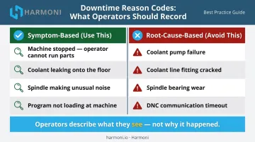
Start with a lean list. Plan to refine it after 30–60 days of live data. Operators will abandon an overcomplicated list, and "Unknown / Other" will dominate your Pareto within the first week.
Integrated Operational Context
A dashboard showing only "machine was down for 18 minutes" is half the picture. Knowing which job was running, which operator was at the machine, and which shift it occurred on makes each downtime event actionable.
Harmoni bridges this gap by connecting machine signals with ERP job data and operator activity. Pulling from integrated ERP systems including Epicor, Infor, JobBoss, ABAS, and ODOO, it automatically tags downtime events with full operational context — no manual data entry required at the time of the stop.
How to Set Up and Use a Manufacturing Downtime Dashboard
Setup and Configuration
Before capturing a single event, map each machine to its signal source and configure:
- Shift schedules — so the system knows when production time starts and ends
- Planned downtime windows — so scheduled maintenance and changeovers don't contaminate unplanned downtime metrics
- Ideal cycle times — so the system can classify short stops as performance losses rather than availability losses
Misclassification at this stage contaminates every downstream metric, including OEE Availability. Get the baseline configuration right before going live.
Initiating Downtime Capture
Downtime capture should trigger automatically when a machine signal drops. The dashboard flags the event, starts the timer, and queues a reason assignment prompt for the operator once the line restarts.
Don't ask operators to log reasons during the stop. Their attention belongs on getting the machine running again. The reason prompt comes after restart.
Verify correct initiation by confirming:
- Each machine transitions between states (running, down, changeover, planned stop) in real time
- Short stops below your defined threshold are captured as performance losses, not downtime events
- Planned stops are classified correctly and not inflating unplanned downtime figures
Reading the Dashboard During a Shift
During a shift, three things should be visible at a glance from a shop floor display:
- Current machine state for every line
- Cumulative downtime for the shift so far
- Real-time OEE Availability against shift target
Operators and supervisors should read this without navigating menus or waiting for a report refresh. If they can't, the display layout needs work.
Set a threshold — 15 minutes of unresolved downtime is a reasonable starting point — that triggers a supervisor notification. The real-time advantage of a dashboard only materializes when someone is empowered to act on it before the shift ends. Harmoni supports this with exception alerts that notify managers as events occur. Visual factory indicator lights (green/yellow/red) at each workcenter signal OEE performance state in real time.
Responding to Downtime Events and Closing the Shift
Watch for clustering during the shift: the same machine going down repeatedly, stops concentrated at the same point in the shift, or a pattern tied to a specific product family. These signal systemic issues, not random failures.
A timeline view or Pareto sorted by machine and reason makes these patterns visible before the shift ends. At shift close, run a structured review:
- Pull the Pareto chart — identify the top 1-2 downtime contributors for the shift
- Note whether any corrective actions were taken in real time
- Flag repeat events for maintenance or engineering follow-up before the next shift starts
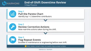
This end-of-shift review is what converts daily data into weekly improvement actions. Without it, even a well-configured dashboard becomes a documentation system.
What to Track on Your Downtime Dashboard
Planned vs. Unplanned Downtime Split
This is the foundational metric. APQC's cross-industry median sits at 5% unplanned machine downtime of scheduled run time — but the target for world-class OEE Availability is 90% or higher, meaning unplanned losses should be well under that threshold.
Tracking this split reveals how much scheduled production time is lost to controllable events versus expected ones — and whether improvement efforts are moving the needle over time.
Downtime by Reason Code — Pareto View
The Pareto chart ranks each downtime cause by total lost time and confirms that a small number of reasons drive the majority of loss. A 2022 automotive-components study published in ScienceDirect found that targeting the vital few causes through Pareto-driven improvement raised OEE by 16.23% and Availability by 4.6% over the study period.
This view is the primary input for deciding where to focus improvement effort each week — and for confirming whether a fix actually worked.
Downtime by Machine, Line, and Shift
Cross-dimensional analysis answers a question the total number can't: is this problem equipment-specific, time-specific, or shift-specific?
- Same machine, all shifts → maintenance issue
- All machines, start of shift only → setup or warm-up problem
- One shift only, all machines → skills gap or behavioral pattern
The same total downtime number has very different causes depending on how it distributes across these dimensions.
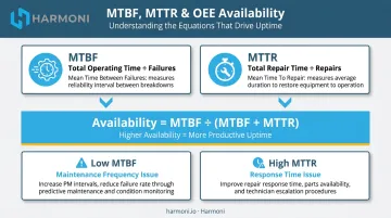
MTBF and MTTR
These two metrics define maintenance performance together:
- MTBF (Mean Time Between Failures) = total operating time ÷ number of failures — measures how reliably equipment runs
- MTTR (Mean Time to Repair) = total repair time ÷ number of repairs — measures how quickly the team recovers
The relationship to OEE Availability is direct: Availability = MTBF ÷ (MTBF + MTTR). Improving either metric improves Availability. Tracking both together reveals whether a downtime problem is a maintenance frequency issue (MTBF too low) or a response time issue (MTTR too high) — two very different corrective actions.
OEE Availability in Context
Downtime drives OEE Availability, but tracking it in isolation creates a blind spot. A top losses view that ranks all six OEE loss categories prevents over-investing in downtime reduction while larger losses in slow cycles or quality go unaddressed:
- Equipment failure
- Setup and adjustments
- Minor stops
- Reduced speed
- Process defects
- Reduced yield
Most manufacturing operations run closer to 60% OEE — well below the world-class 85% target. That gap rarely lives in downtime alone. A dashboard that surfaces all six loss categories shows where to act first.
Best Practices for Using a Downtime Dashboard Effectively
Review data during the shift, not only after it. The most impactful use of a real-time dashboard is enabling a supervisor to respond to an escalating stop before it costs a full hour. Post-shift analysis is valuable for planning, but in-shift visibility is what prevents the damage.
Keep reason codes lean and operator-friendly. Limit the list to reasons an operator can identify and assign in under 30 seconds using direct observation. Overly granular codes create avoidance behavior and drive up "Unknown" entries that corrupt Pareto analysis.
Build role-specific views. A single dashboard trying to serve operators, supervisors, and managers typically serves none of them effectively:
- Operators need live machine state and shift target progress
- Supervisors need shift Pareto and top loss rankings
- Managers need weekly trend data and cost impact summaries
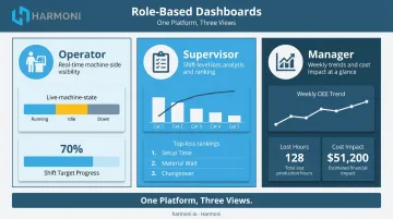
Harmoni's platform supports role-based views out of the box — operators see real-time OEE indicators at their workcenters, managers access production dashboards and shop floor maps from the web portal, and executives receive high-level KPI summaries.
Apply the track-pick-fix cycle using the Pareto. Once the dashboard captures clean data, focus improvement effort on the top two or three downtime reasons each week. Confirm the fix worked by watching the Pareto shift before moving to the next issue. Done consistently, this cycle turns reactive reporting into measurable loss reduction.
That precision requires context. Harmoni automatically surfaces which jobs, operators, and machines are associated with each downtime event, giving teams specific operational detail — job number, shift, machine ID, reason code, operator activity — rather than generalized patterns to work from.
Conclusion
A downtime dashboard's value comes from the discipline applied to reading and responding to it — not from the data it collects. Real-time access and reason code accuracy both matter, but the end-of-shift review habit and the willingness to act on in-shift alerts are what separate factories that report downtime from factories that reduce it.
Treat the dashboard as a live operational tool, not a post-shift summary. When downtime becomes visible as it happens, the entire team's relationship with production loss changes. Improvement becomes a daily practice rather than something addressed in a monthly debrief — and that daily practice is what turns dashboard data into fewer lost hours, more consistent throughput, and a shop floor that gets better over time.
Frequently Asked Questions
What is a manufacturing downtime dashboard?
A manufacturing downtime dashboard is a real-time visual tool that tracks machine stop events, assigns them to reason categories, and displays key metrics — including planned vs. unplanned downtime, MTBF, MTTR, and OEE Availability. It helps production teams identify and reduce production loss by making stop patterns visible as they occur.
What metrics should a manufacturing downtime dashboard track?
The core set includes planned vs. unplanned downtime, downtime by reason/machine/shift via Pareto, MTBF, MTTR, and OEE Availability. How those metrics break down across machines, shifts, and reason codes matters as much as the totals — the same aggregate number can point to very different problems depending on distribution.
What is the difference between planned and unplanned downtime?
Planned downtime is a scheduled stop during production time — changeovers, preventive maintenance windows, tooling changes. Unplanned downtime is an unexpected stop from equipment failure, material problems, or other unforeseen events. Both reduce OEE Availability, but they require different corrective responses.
How do I get accurate downtime reason codes from operators?
Keep the list short (under 25 codes), have operators assign reasons after the line restarts rather than during the stop, and limit choices to what operators can observe directly. Asking operators to diagnose root causes rather than describe symptoms generates avoidance behavior and inflates "Unknown" entries.
What are MTBF and MTTR and how should I use them?
MTBF (Mean Time Between Failures) measures average operating time between failures; MTTR (Mean Time to Repair) measures average time to restore production after one. Tracking both together reveals whether a downtime problem is a maintenance frequency issue or a response time issue, which points to very different corrective actions.
How often should a manufacturing downtime dashboard refresh?
Shop floor dashboards should update in near real time, ideally within seconds, so operators and supervisors can act on in-progress events. Dashboards pulling data from ERP or batch systems may have slightly longer refresh cycles, but any delay beyond a few minutes limits the ability to respond during the shift.